
When deciding how a site should look on phones, tablets, and desktops, responsive web design is a design approach that lets layout, images, and CSS adapt fluidly to any screen size. It relies on techniques like media queries, fluid grids, and flexible images to create one codebase that works everywhere.
At its core, responsive web design (RWD) means the page rearranges itself depending on the viewport width. The idea, coined by Ethan Marcotte in 2010, replaced the old practice of creating separate desktop and mobile sites. Instead of multiple codebases, you write one set of HTML and CSS that responds to the user’s device.
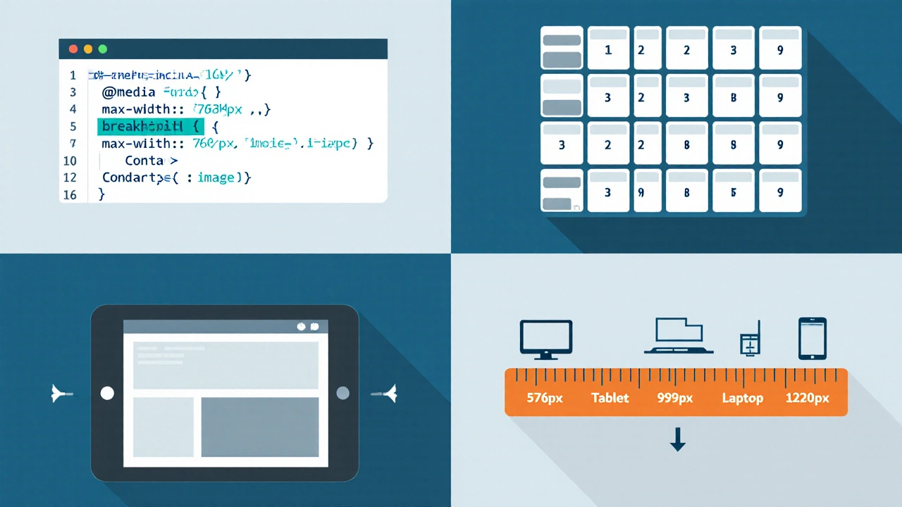
RWD isn’t magic; it’s a toolbox of four main pieces.
@media (max-width: 768px) { … }.max-width: 100%; to avoid overflow on small screens.All four work together. Media queries tell the browser when a breakpoint is hit; the fluid grid and flexible images then adjust the layout accordingly.
RWD is the go‑to solution in several common scenarios.
In these cases, the mobile‑first design philosophy often guides the workflow: start styling for the smallest viewport, then add breakpoints for larger screens. This ensures core content remains usable everywhere.
RWD isn’t always the best fit. Here are three situations where you might look elsewhere.
Below is a quick visual comparison.
| Aspect | Responsive Web Design | Adaptive Design | Native App |
|---|---|---|---|
| Codebase | One HTML/CSS/JS set | Multiple HTML versions per device | Platform‑specific (iOS/Android) code |
| Development cost | Low‑to‑moderate | Moderate - more testing per device | High - separate native projects |
| Performance | Depends on CSS/JS size; may load unused code | Higher - serves only needed assets | Best - compiled code, direct hardware access |
| SEO | Strong - single URL per content | Good - but duplicate URLs can confuse crawlers | Limited - app stores, not indexed like web pages |
| Maintenance | Easy - single source of truth | Harder - multiple versions to sync | Hardest - separate codebases per OS |
Use this quick list to know if RWD is right for your next project.

Even if you’ve decided on RWD, avoid common mistakes that slow you down.
srcset and sizes for images so the browser only downloads appropriately sized assets.Search engines treat a responsive page as a single URL, consolidating link equity. Use viewport meta tag correctly, avoid hidden content tricks, and keep the responsive CSS clean to prevent crawl‑budget waste. Google’s Mobile‑First Indexing means the mobile rendering is the default for ranking, so a well‑implemented RWD directly boosts visibility.
They’re related but not identical. Mobile‑first is a design philosophy that starts with the smallest screen and builds up, whereas responsive web design is the technical implementation that makes the layout adapt at any size.
No. Choose breakpoints based on design needs-typically where the layout naturally changes-not on each device model.
Yes. Many sites use a responsive base and serve optimized assets (like different image sizes) via adaptive server logic for performance gains.
Responsive layouts must preserve readable font sizes, logical focus order, and sufficient color contrast at every breakpoint. Use ARIA landmarks and test with screen readers on both small and large screens.
Frameworks like Bootstrap or Tailwind give you ready‑made grids and breakpoints, speeding up development. However, they add extra CSS weight, so evaluate if the built‑in utilities match your project’s performance goals.