When talking about breakpoints, the specific screen widths where a layout shifts to a new arrangement. Also known as CSS breakpoints, they let developers tailor content for phones, tablets, and desktops without rewriting the whole site. Responsive design an approach that makes web pages adapt to any device relies heavily on these thresholds, and media queries CSS rules that apply styles only when certain conditions are met are the tool that enforces them. In practice, a developer defines a set of breakpoints—commonly 480 px, 768 px, and 1024 px—and writes media queries that adjust grids, fonts, and images at each point. This workflow breakpoints connects directly to fluid grids layout systems that scale columns based on available space, ensuring that content reflows smoothly rather than jumping abruptly. The viewport the visible area of a web page on a device also plays a role: setting the correct meta viewport tag tells browsers how to interpret breakpoints relative to the device’s screen. Together, these concepts create a seamless user experience across the entire device spectrum.
Understanding breakpoints is essential because they dictate how a site feels on different screens. If you ignore them, visitors on a small phone might see cramped text, while desktop users could be presented with wasted whitespace. By mapping breakpoints to user contexts—like portrait vs. landscape, high‑density displays, or folding devices—developers can prioritize performance and readability. Media queries enable conditional loading of assets, so images and scripts only fire when needed, which cuts down on bandwidth and speeds up page loads. Fluid grids complement this by providing a baseline that stretches or shrinks gracefully, reducing the need for multiple fixed‑width layouts. The viewport meta tag completes the loop, translating CSS pixel values into real‑world dimensions, so a breakpoint set at 768 px truly reflects a tablet’s width rather than a scaled desktop view. This trio—breakpoints, media queries, fluid grids—forms a feedback system: as the viewport changes, the browser evaluates media queries, which then adjust the grid, delivering an optimized layout at every size.
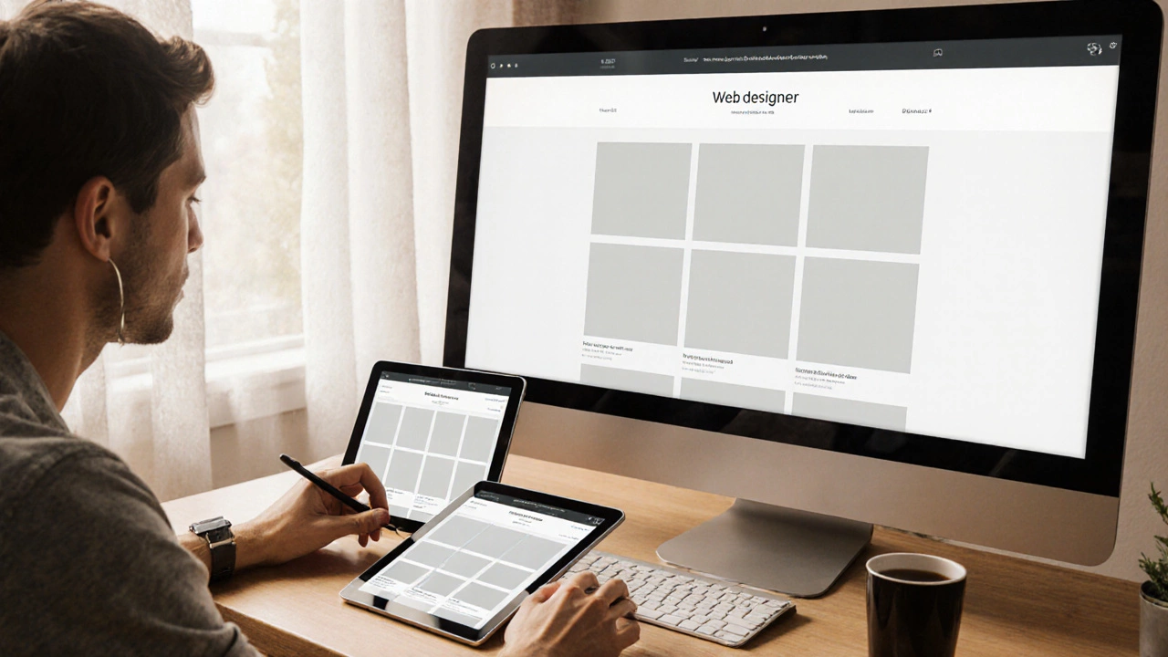
Below you’ll find a curated collection of articles that dive deeper into each piece of this puzzle. Whether you’re curious about how to choose the right breakpoints for a new project, need step‑by‑step media query examples, or want to explore advanced fluid‑grid techniques, the posts cover practical tips, real‑world case studies, and up‑to‑date best practices. Browse the list to see how seasoned developers tackle responsive challenges, and grab actionable insights you can apply to your own sites right away.
Learn when responsive web design is the right choice, its core tools, how it compares to adaptive and native solutions, and a checklist to decide the best approach for any project.


